")


Conversion killers may be the reason your website stopping customers in their tracks.

Are you spending hard earned dollars sending traffic to your site and still, no sales?
Sometimes we are just too damn close to our website, products and business to be able to step back and see what customers are seeing.
People landing on your website for the very first time, who don’t know your products and how awesome they are.
People who only have your websites pages, photos and words to make a decision whether or not your products are right for them.
And often there are sooo many areas that are sending customers running for the hills and we don’t even know they are there, until someone points them out.
Today I’m here to do the pointing. 👇🏻👉🏻👐🏻
In this episode, I share with you the most common conversion killers that are costing you sales and how to fix them.
Tune in and learn exactly what they are and start making more sales from you eCommerce store today.
Listen here 👇🏻
OR TUNE IN: APPLE PODCASTS | SPOTIFY | GOOGLE PLAY
For the speed readers, here’s an overview below (but tune in for more insights). 👇🏻
Conversion Killers Episode Overview
Today, we are going to talk about conversion killers or reasons why your website isn’t converting. I’m going to take you through five different areas of your website that might be stopping potential customers in their tracks from hitting add to cart and popping in their credit card details. Because I know it takes time and effort on a day to day basis to send traffic to our website and seeing them come and drop off makes us all very sad and obviously doesn’t help us pay the bills.
Your Website doesn’t make a good first impression
The number one conversion killers for websites, and particularly for fashion and lifestyle websites, for those that are fairly new in the game is that the website overall does not make a good first impression. In fact, it often looks amateur or outdated or just very unappealing.
Think about your website as if it’s the shopfront of a bricks and mortar store down the road. Does it make a good first impression? Does it look inviting? Does it encourage people to come through and have a good look around or does it look like it needs a good coat of paint and dust off cobwebs in the corners?
Because today it’s a very competitive space in the eCommerce space, it’s never been easier to create and update our websites and make them look really professional and like they’re a million dollar site even if they’re not. So if you are spending, if you’re doing all of this marketing and all this hard work, and you’re developing products and investing in inventory, only to then send people to a very poor looking website, you are definitely not going to be getting those sales that you need.
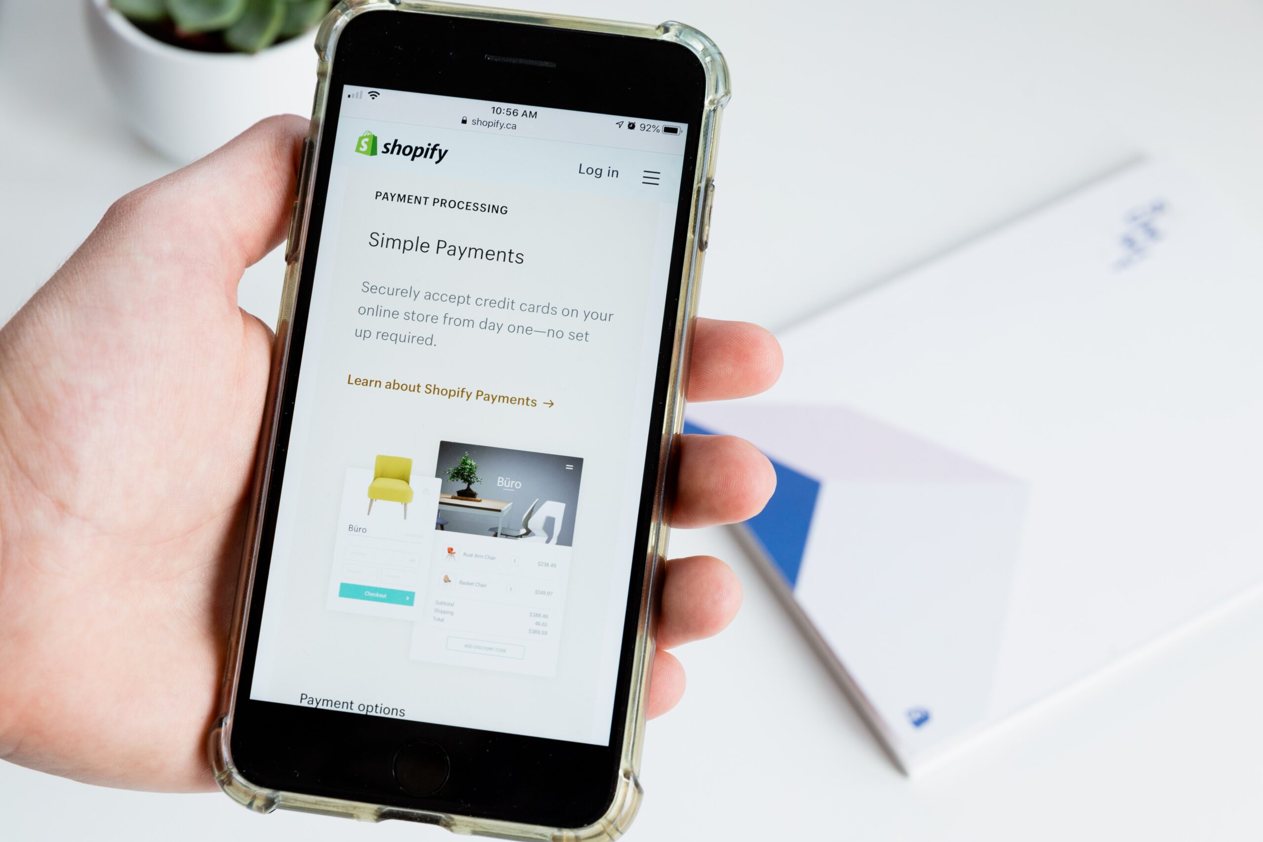
Now, I am an advocate for Shopify, I’m not affiliated with them in any way but I live and breathe eCommerce, I still have and run my own ecommerce store. Shopify for me is the gold standard in software that helps you manage your site yourself. There’s nothing worse than being in a position where if you want to make small changes to a website, you have to go and pay a contractor or a developer and wait all this time just for basic changes. Shopify is really easy to learn by yourself. It’s easy to manipulate yourself and make changes. So that’s why I really recommend it. Plus, it works seamlessly with all of the other supporting software that we need, like Klaviyo, like Facebook ads, like TikTok, Pinterest, all of the different channels all plug in very nicely to Shopify. So that’s why I love it but I love it mostly because for a small business owner, it’s very easy to update and edit yourself given that our website needs to look appealing it needs to instill confidence in our customers. If you have just popped something together or Uncle Bob built your website, I don’t know 12 months ago and you’ve not really tinkered with it or updated it since you are definitely going to be losing sales. Now. I know for one, we are often in the inside of Shopify, we’re looking in the back end of it, we’re looking at the sales and the traffic and the analytics, we’re not always looking on the front end of it.
Your Mobile site is slow
All right, number two conversion killers is that your mobile site is slow and clunky. Or it’s just not a great user experience. More than 50% of my website visitors for iland co. are coming from their mobile phone. I know more often than not, I’m shopping for my mobile phone, not I’m not pulling out the laptop, I don’t often look from my desktop. So we need to make sure that your mobile site is absolutely optimised in order to create a great user experience for mobile shoppers. Now, I’ve just done a bit of an audit online recently and discovered my mobile sites actually really slow. So we’re looking at ways to increase the speed of the images and the videos loading on our mobile site. Also, we’ve turned off all of our apps that pop up for the mobile site, because often those apps are really big, and they block other buttons and other sections. And I’ve been to a website recently, where there was three competing pop ups on the mobile site all over the top of each other. So they were layered on top of each other, you had to try and find the x to try and close each of them. And it was just annoying, honestly.
So we want to make sure that the mobile site is schmick, because that is where more than half of your visitors will be shopping via. So again, go away and have a look, have other people test it for you, have them tell you what it’s like and give them a discount code for 100%. And then, you know, refund the audit done, actually ship them the thing. So they can go through the whole process of buying from your site on a mobile and making sure that everything works nicely.
You have Dead links or your store is hard to navigate
Okay, conversion killers number three, your website is hard to navigate, or there’s dead links, or it’s just not a clear path to purchase, we want to make sure that our customers can use the least number of clicks, in order to add something to their cart and check out, we do not want to make it difficult for them. We don’t want to make it hard for them to buy, for example, making them set up an account and a password. In order to actually get to the checkout, we want to make sure that there’s like I said, the least clicks as possible. So just think, click, click, buy. Hopefully, they can click on the product, I’d add it to their cart, click and add in their details. And another click and that’s done. We want to make sure that that’s really easy to navigate. And again, check this on your mobile and on a laptop because often the mobile navigation is a little different to what it is on the computer. Also make sure that it’s not sending them off to a dead link. I just had a look on it on our website now and then there was a whole accessories section and I clicked on the link and it took me to a 404 Dead page, which isn’t great. Making sure that even your social media links and email links and things like that are really easy to see and find but also work, don’t send them to a dead link.
Your Product pages aren’t strong or compelling people to buy
Conversion killers number four is your product pages just aren’t strong enough. Now think about it. The product page is where they make that decision. Do I want to buy this thing or not. So if your product pages aren’t showing clear, good quality professional looking images, they don’t have to be actually paid for if you you need to make them look professional, though, if there’s not clear size guides, if there’s no clear information around shipping, if there’s no clear information about whether or not you know, if they if they don’t like this thing or how it doesn’t fit them what the refund policy is, you need to make sure all of these elements are included on the product pages, so that your customers can confidently click an add to cart. We don’t want them having to click off the product page to go and find the size guide. We don’t want them to have to leave that product page to then go and have to find the shipping costs or the refund information. We want to make sure all of that information is available to them on the product page so they can confidently go yes, I want it add to cart and then click on to the payment options. So making sure that your product pages are super super strong because they are essential. If you’ve got a person from your homepage to your product page and they like what they see but if you’re not presenting the product, correct, or integrating it in a professional looking way or aren’t giving them all of the information they need in order to make that purchase, they will simply click off and leave.
There’s a Lack of Trust elements
Now the final conversion killers I want to talk about today is is having no trust elements on your site. So this means a customer lands on your website, but they’re not quite sure if you’re the real deal. Everyone knows someone that’s been ripped off online. So there is definitely some hesitation. So if you don’t have any trust elements on your website to build up that trust, to assure your visitors that you are a real life professional business, you’re not just going to steal their money that will absolutely hamper your conversions. Now, ways we can do this is by having real customer reviews, both on the homepage, if you can highlight some of your best ones, and also on the product pages, it’s also making sure that their contact details are visible for you. So an email address, if you can have a phone number that’s even even build even more confidence because people know, okay, I can pick up the phone and ring someone, make sure that someone answers or there’s an answering phone, answering messages, voicemail message on that phone number, I rang a business the other day, and it just went this, this number does not work. So make sure that you’re making it very obvious to the customers that you are a real life business, you are professional, you are going to send them their things, you’re not going to steal their credit card details and run off. Another way we can do this is to have badges on your website, things like that, the checkout that you know you have those little badges and you can generally find these inside of the Shopify app store like you know, secure checkout, we you know, 100% safe all those different badges that you can have. Even if you offer refunds like we do for iland co., we offer 30 day refunds, having a badge that says 30 day refunds within your site on the product pages in the checkout will instil confidence in your customer that you are a real life business.

PRIVACY POLICY
SITE TERMS & CONDITIONS
JodieMinto.com - COPYRIGHT 2024 © Jodie Minto | OSS Australia Pty Ltd ABN: 19 661 994 707
terms of service
We acknowledge the Traditional Owners of this land and the Darkinjung people of the local area we work in. We pay our respects to the Elders, past, present and emerging.
follow me